
Amaryllis Pay
The Problem
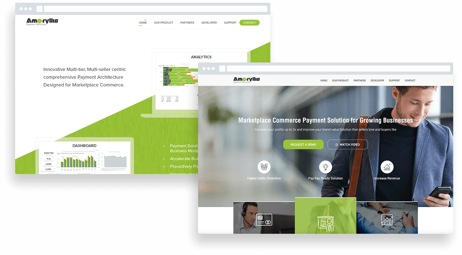
When they contacted us, Amaryllis Pay already had a successful business with a good customer base; however, their previous website design failed to reflect the level of service that they provide. It was outdated and fell short of their competitors’ online presence.
The Solution
If you are struggling to take a bigger share of the market and really want to leave your competition in the dust, having the right website is a key factor for success. The first thing that we did on this project is have a good, long talk with the team at Amaryllis Pay. We had to understand their unique selling points, their personal taste and their specific branding guidelines. We made sure that we communicated properly with their target market with clever design techniques. When you see someone that you can associate with, you are subconsciously - and sometimes consciously - attracted to what is being offered. We ensured that the structure and overall aesthetics of the website stayed simplistic, so that it was easy for visitors to quickly comprehend exactly what Amaryllis Pay offers. As web designers, we are especially aware of the colors that we use for each client and brand. Colors have a certain psychological power, and in the case of Amaryllis Pay, we chose to emphasize on the colors Green and Gray. Green is the color of balance, of progress and freshness, while Gray on the other hand is the color of intellect. It is also perceived as long-lasting and classic. As a progressive and intelligent company that is here to disrupt the market, Amaryllis Pay loved the new web design.

The Client
Amaryllis Pay is a company offering marketplace commerce payment solutions for businesses that grow fast. They pride themselves with their innovative approach, sophisticated back-end technology and yet simple and user friendly system that gives businesses a lot of options. Amaryllis Pay is based in Florida but they work with clients from all over the country.