
5 Examples Of The Best Optometrist Websites
Scroll DownNote: If you want to leave it to the professionals, then contact us to build an amazing website for your optometry practice.
Why is it so difficult to see (pun intended) the significance of a good website design for an optometry practice? Unless one was born in the 60’s or earlier, chances are that they will not be picking up the yellow pages to look for an optometrist. Even my grandfather (god bless his soul) would have looked it up on Google, compared a few websites and then proceeded to make his appointment.
So what does an optometry website tell us about its practice? Hours and location? Of course. A list of their services? Hopefully. But is that it? Shouldn’t you be a hundred percent sure that if you choose one clinic over another, that you will be treated by a professional team of experts? Recognized among the best web design companies, we especially understand the impact that a well-designed website has on your leads and sales. A great optometry website is an indication of the quality of service and care that your patients will receive. Since you have the latest equipment and technology at your clinic, it only makes sense that your website should be up-to-date as well.
Don’t take my word for it, just ask yourself how often you’ve opened up a business website and then decided to choose their competitor because it either loaded horribly slow, couldn’t be accessed on your mobile device or just looked very unprofessional? We’ve collected a few examples of websites, in no particular order, that have been designed well and follow the basic laws of conversion. Feel free to use this article while coming up with a new creative web design for your practice, or simply to note down what your website is currently lacking.
1. Pro Optix Eye Care
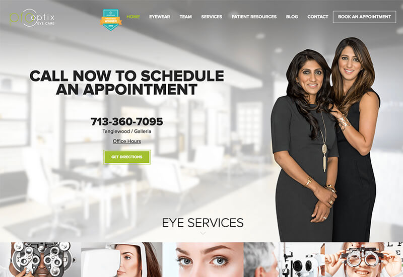
First things first, this optometry website exudes professionalism without seeming boring and monotonous. Right away, you’re greeted by real pictures of approachable doctors and that instantly creates a very welcoming feeling. They have an obvious call-to-action at the top of the page which makes their number easily visible, and they have a friendly “get directions” button which opens up a small map in the browser so you’re instantly able to see how far you are from their practice. The ‘office hours’ are listed in clear sight via a pop-up link, so that keeps the clutter out (as opposed to some websites that put their entire hours of operation on the website) — remember ladies and gentlemen, less is more! They highlight all of their services by good imagery, and they list out some of the major brands that they offer at their clinic. Associating your brand with well-established brands only makes your brand that much more credible, wink wink.
Throughout the website they have pictures of their staff and their facility. One of my favorite things here is the “customers love us” section which automatically syncs instagrams posts by their fans to their website, and also the ‘honorable mentions’ that links to their press. If we see social proof for a business or product, that’s generally all the validation we will need; this is why you & I read reviews before ordering slinkies on Amazon! Okay, maybe not slinkies! In every bit of the website, they highlight their accolades and provide proof on why they’re the best optometrists in Houston.
2. Perspective Family Eye Care
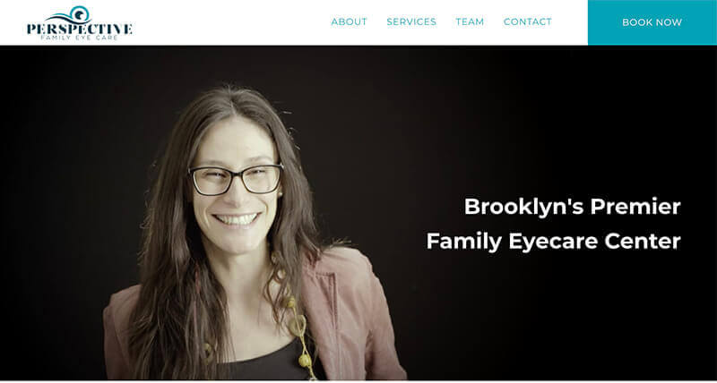
If you thought Pro Optix gave a great initial impression, then check out Perspective! The creative video at the beginning is remarkable: it starts off in black and white with patients putting the glasses on and then suddenly they introduce some color in the video and it’s all smiles from there! Our ancestors used to say that a picture is worth a thousand words — I wonder how they would have felt about videos.
They have nice typography and make it very clear what they do right from the start. Personally, I would suggest a strong color for the ‘Book Now’ button because the shade of blue they currently have is the primary color of the website. It’s good to have disparity in colors when it comes to main action buttons — it’s interesting how you can use different pops of color to draw a visitor’s attention! This is a great example of a one-page website design! I do wish their appointment form was custom built for them instead of linking to a third-party service.
3. Warby Parker
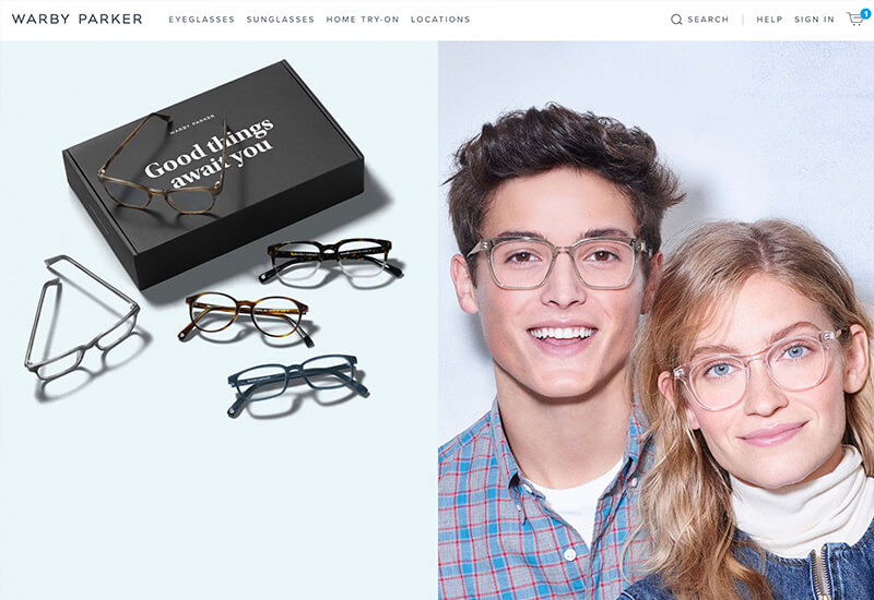
This! This is what great website design looks like. I think this is my personal favorite from the collection. Clean fonts, outline icons (as opposed to bulky), thin lines and good use of white space. From the get-go, they give you two clear options: questionnaire or online shop. If the quizzes in school were as fun as their questionnaire, I wouldn’t have spent half of the quiz drawing scribbles!
The online shop experience is especially impressive because they highlight individual products extremely well! The product pages tell you everything you would need to know about the glasses while providing different angles to give you a better idea of how they would look. The checkout process is intuitive and easy to follow-along without any fuss, so if you’re planning on adding ecommerce to your website, let Warby Parker be a good example to follow.
4. Lenscrafters
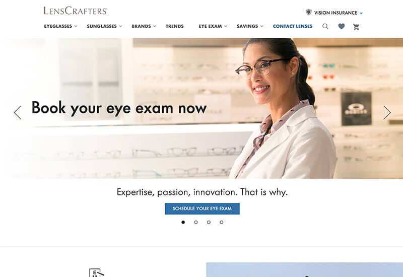
They have 800+ stores, so they must be doing something right! Being greeted by a huge banner image and an obvious call-to-action is a great way to get things started. Tip: adding “now” increases the conversion rate, e.g. ‘book appointment now’ instead of just ‘book appointment’. They have a terrific color palette with intriguing font choices. This is a good demonstration of balance between traditional and modern web design. I particularly like their locations page because they make it so easy for visitors to find a location nearest to them, so that they can be on their way to schedule an appointment.
The shop experience is not as cool as Warby Parker, but it does have a charm of its own. One thing that they do better is that they list reviews from their customers on specific products — were you paying attention to the importance of social proof, or have you been thinking about slinkies ever since?
5. Chicago Vision Club
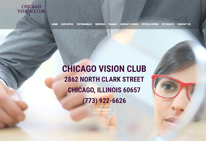
The starting screen is a video of a woman trying on glasses at a clinic so that instantly draws you in on the experience. It almost feels like you’re the one that’s trying on a pair of glasses. They have their address and phone number visible at first glance, but I do feel their conversion rate would increase if they put a call to action above the video.
As you scroll down, they share their story and list out their services. They also have a section for the brands they carry and the insurance providers that they accept. So if your optometry practice accepts insurance, then be absolutely sure to list out your insurance partners. They have a cool parallax effect with fantastic imagery, and they’ve featured their current promotion on the page.
6. Eyepic Eye Care
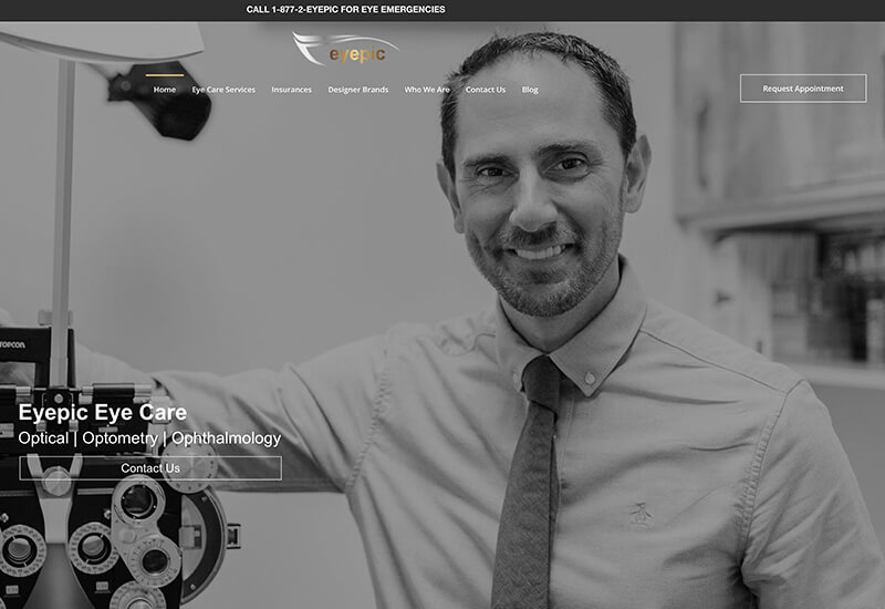
Hey, who doesn’t like a bonus! Eyepic was recently refreshed with a new website design and their bounce rate decreased by 15%. A bounce rate is a representation of people that visit and leave a website without viewing the other pages. As an optometry practice, you always want your potential customers to take the next step, whether that’s booking an appointment or simply viewing the services that you provide.
Eyepic opens with a welcoming image of a smiling doctor standing besides a phoropter. Their CTA is as clear as day and located prominently. As you scroll down, you’ll see more visuals and a copy that will help customers choose their facility. Finally, you’re greeted by testimonials and video references from other doctors in the team. They neatly display all of the brands that they carry and make their locations easy to find.
How to create an exceptional optometry website? What did you think of these spectacular websites? If you’re interested in redesigning your website, definitely have a look at our extensive guide of tips to designing one of the best optometry websites.
If you would like our help, then get in touch now. Whether you’re on your way to open your first optometry practice, or have been in business for years, we would love to help you grow. We love to put together creative websites that are unique to each brand and their customers. If you want to hire another firm, here are 14 must-ask questions before hiring a web design company.

Results-driven
creative solutions.
#1 Houston Web Design Agency
Request a Quote