5 Examples Of The Best Real Estate Websites
Scroll DownThere are many facets to real estate – you have the home builders, residential and commercial properties, and then finally the private equity firms that are in charge of the funding and development. Regardless of where you fall in that timeline, it’s imperative that you have a solid looking and functioning website! To put it simply, a good website design builds a lasting first impression, helps bring your prospective clients on board, and increases conversions. On the contrary, a bad website design will cause you to miss out on those sweet prospects and your competitors will love you for it. In this article, I specifically want to highlight 5 examples of the best websites for builders, multi-family properties and some private equity firms. So, in no particular order and without further adieu!
1. Blackacre Builders
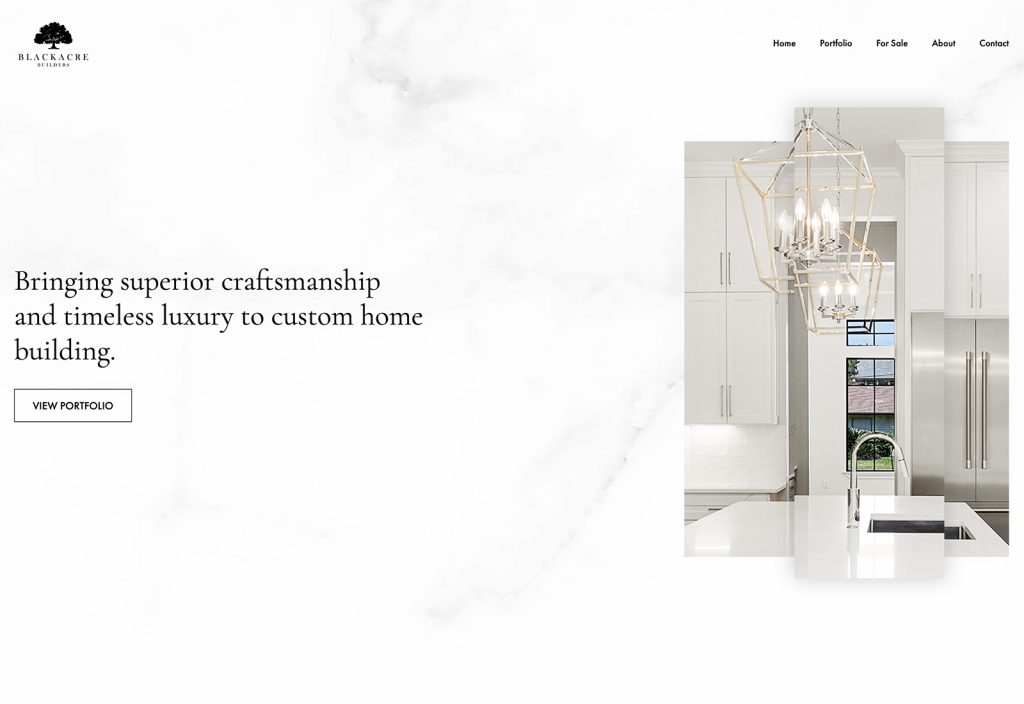
This is hands down one of the best website designs for a home builder looking to show off their portfolio; I’m not making this claim simply because our team worked on it, I’m telling you because we scoured the web and searched high and low – take a look for yourself. Before our team starts with the sketch, we figure out who exactly our partners want to target and what their pain points are. In this case, we had to create something that radiated opulence and what’s a better way to do that than marble! We used the marble patterns throughout the site because we wanted to incorporate some of their building elements, so that the website also felt like one of the homes built by Blackacre.
If you’ve seen some of our work, you’ll know that we love minimalistic design, because repeat after me – LESS IS MORE! That clutter-free, clean feeling that you get when you navigate through Blackacre Builders website is what we call minimalism. We used a neutral color palette and also edited the images to visually complement the rest of the website. The navigation in the header is subtle so that all the emphasis can be on the imagery and call-to-actions. Similar to a website design firm, the first thing you will want to see when you visit a home builder is their work, so we had one short tagline along with the ‘View Portfolio’ button. After analyzing their traffic, I can confidently say that the majority of their visitors first visit their portfolio, then look at their testimonials and finally contact them to inquire about their services. Please remember, you do not only want a pretty website – you want something that will actually help increase your revenue.
2. Clear Capital
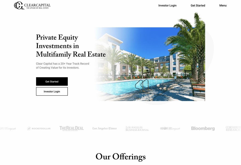
Now you may be wondering, why would such a huge organization based in California hire a Houston web design company? It may come as a surprise, but most of our clients are actually outside of Houston and often discover us through our work that we’ve created or through referrals. Clear Capital is a private equity investment firm with over 350+ active investors and nearly $1 billion of multifamily real estate assets. This is crucial information, and is made apparent immediately upon landing on the homepage. After identifying their user personas, we discovered that the main target audience would be potential investors, but we also had the challenge of balancing the experience for existing investors as well. From the start, new investors are encouraged to ‘get started’ and throughout the website, we’ve made it easy for existing investors to sign into their portals.
The team at Clear Capital was a pleasure to work with and gave us the creative freedom to craft their beautiful website. They have a lot of content so we made sure that the website design never felt too busy, because overwhelming designs become outdated quicker than Houston loses in the playoffs (still a fan though)! People are inundated with information all day long, so clean and simple design tends to be timeless, simply because it’s not “pushy”. The website design for Clear Capital is as classy as they come, and all of the important decision-influencing elements are being showcased sequentially. I can’t drool over our work for the entire day, so let’s move along!
3. E2 Homes
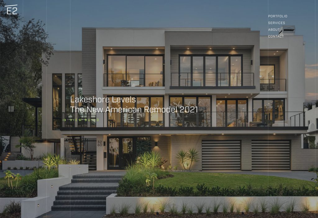
Even though we did not craft this design (I’ll give credit where it’s due), E2 homes is a very close second for having one of the best home builder websites. “Full-bleed” images are quite common in real estate websites, so if you have the budget to professionally photograph high resolution eye-catching pictures, then it’s a great idea. E2 absolutely nails this – their homes are astonishing to look at inside and out, so it’s only fitting that their pictures are the main highlight of the website. One of the downsides to this is the legibility of the text over the pictures, and while it works for shorter headlines, it’s rather annoying to read large paragraphs.
This website design looks professional and fresh. I can tell that the designers paid attention to detail on the homepage. The most effective real estate websites are easy to navigate, visually appealing, and user friendly. The navigation menu in the header stays fixed as you scroll down, making it easy to access without having to scroll all the way back up and having a custom cursor was also a good touch.
4. Crestview
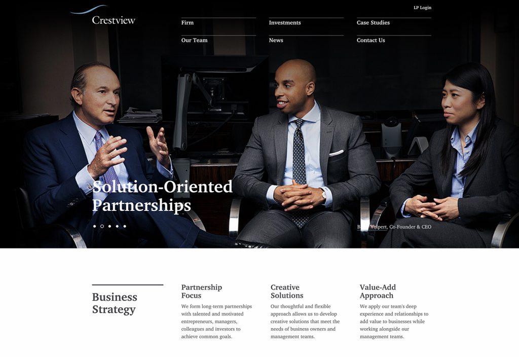
Ladies and gentlemen, if ever, you’re curious about whether or not you should hire a great photographer for your private equity firm – let Crestview remind you why you absolutely should! The contrast between the dark photography and utilization of white space has been excellently executed. A lot of real estate companies introduce their website by showcasing their properties in their hero images, but Crestview took a good alternative approach and opened with pictures of their partners.
The feeling of eminence that you get from their website through the Hollywood-esque photography and structure, makes it clear what kind of partnerships Crestview is looking to form.
5. RIPCO
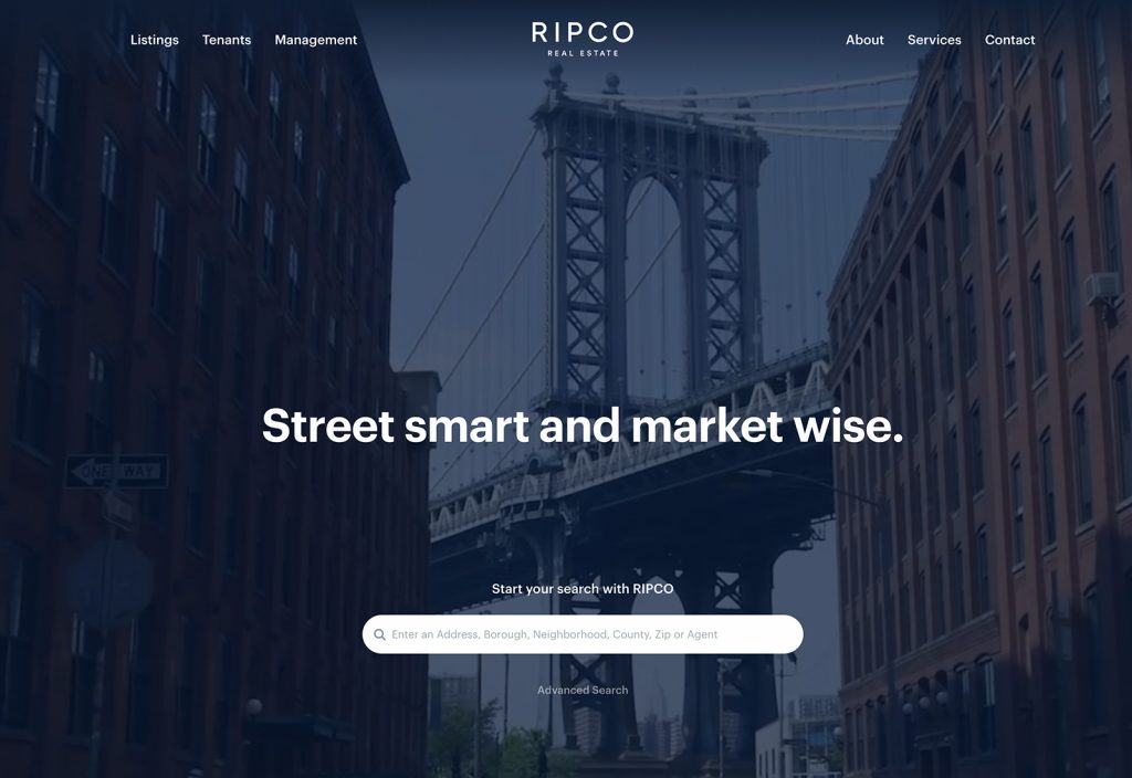
A website is the most widely used tool for real estate agents to connect with their clients and RIPCO’s website most certainly helps them to create a presence that stands out from the competition in NY & NJ. They welcome users with a beautiful video montage of the New York skyline and keep the copy minimal so that all of the attention is being drawn exactly where it needs to be. It’s one of our favorite things to say at 71Three, so I’ll say it again for the millionth time – less is more!
Associating your brand with larger brands immediately makes your brand seem larger, which is why RIPCO ‘name drops’ some of their clients, such as: Target, Best Buy, Chase and Starbucks. This website is a beautiful balance between creativity, grace and minimalism.
Who Should You Hire?
A lot of real estate companies and private equity firms are trying to build a great website since it is really important for them to represent their brand across the web. However, while not all of them succeed, some are definitely far more successful than others. At 71Three, we understand what makes one company’s website better than another. The importance of having a strong presence online cannot be overemphasized in today’s competitive digital landscape. How important is it to you to do better and stand out from your competitors in the real estate industry?
Reach out when you’re ready to strike a conversation, because we truly understand your industry and may be a good fit for you.

Results-driven
creative solutions.
#1 Houston Web Design Agency
Request a Quote

